In this DataSherpas quick tip we show you how to make a graph in Google Sheets. Graphs in any spreadsheet application, including Google Sheets, can help really tell a story with your data more visually and help bring your data to life.
We are going to cover how to add three popular types of graphs to your Google Sheet – pie charts, line graphs, and bar charts.
- Pie charts are often best used for comparing relative sizes of data across a few categories – for example, let’s say you have responses to a survey question with four possible answers to the question – you could use a pie chart to help visualize how many survey participants chose each of the four possible answers.
- Line graphs are usually used to look at data over a period of time (or similar dimension). You may have sales data by sales rep, geographic area and month – you could use a line graph to chart out sales over time by sales rep or sales over time by area.
- Bar charts or bar graphs can be used in a similar way to pie charts to help you visualize relative sizes of data by category. An example – your data may contain house sales data by town or city. You could use a bar chart to show clearly which town or city had the most house sales in a given year. Bar charts are also really helpful if you sort the bar chart in descending order. This will clearly show which data category (town or city in our example) has the most house sales for the time period, which category is second, third etc.
What you will need to start adding your Google Sheets graphs.
Before you start making your graph in Google Sheets, you will need:
- Access to Google Sheets. Access to Google Sheets is available for free if you have a Google account.
- Some data:
- For pie charts and bar charts you will need data with a few or more categories and a metric (value) you want to visualize in the chart.
- For line graphs you will need time series (or similar) data – e.g. sales by product category by month.
Assuming you have all this in place you are ready to start adding your graphs.
Introduction to the process of adding a graph to Google Sheets.
We will first explain the general process of adding any type of graph in Google Sheets, we will then explain the specifics of adding each type of graph or chart and some common customizations you may want to apply.
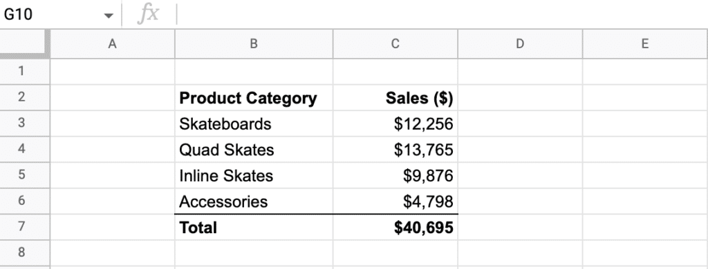
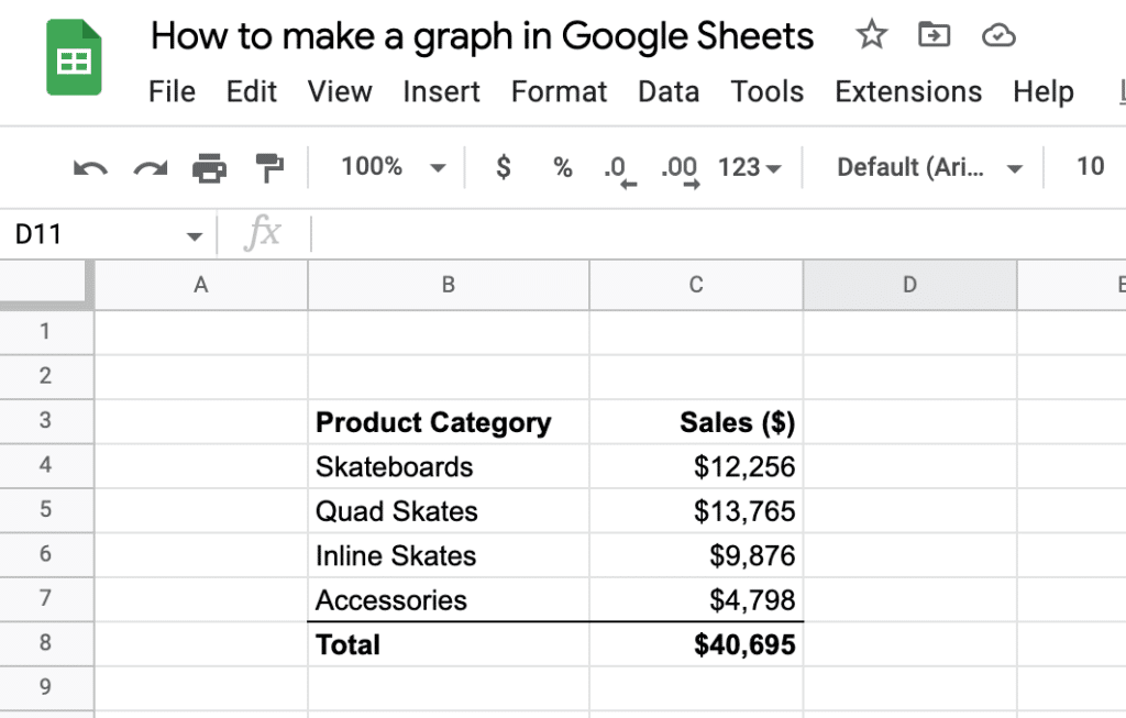
Open your Google Sheet containing the data you would like to show as a graph or a chart. You can see our sample data in the image below. It is made up of sales value (in $) by product category. This lends itself to being shown as a pie or bar chart – in this overview section we will visualize the data as a pie chart.
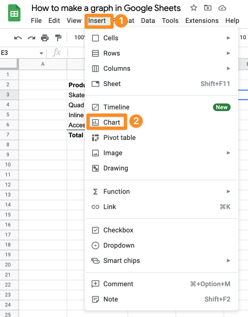
Next go to the top menu in Google Sheets and choose the “Insert” menu. You will see several options in the sub menu – select “Chart“.
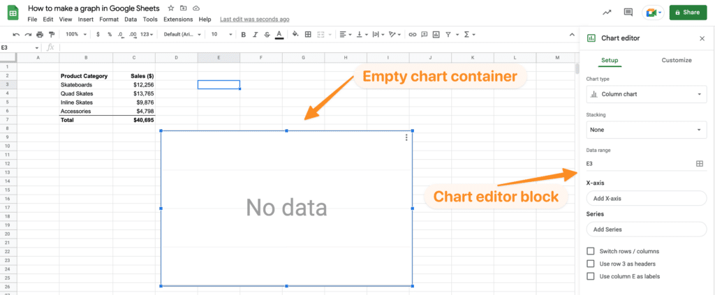
After choosing the Chart option Google Sheets will now insert an empty chart container on your sheet, together with a “Chart Editor” block on the right hand side of your screen.
Next we need to tell Google Sheets what type of chart we want to add into the sheet and also what data to use in the chart.
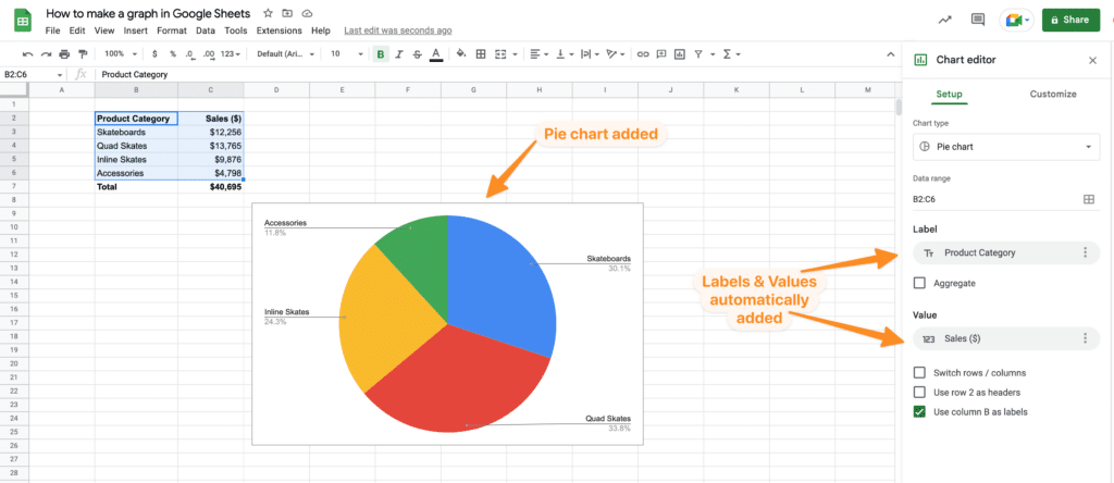
In our example we are going to change the chart type to “Pie Chart”
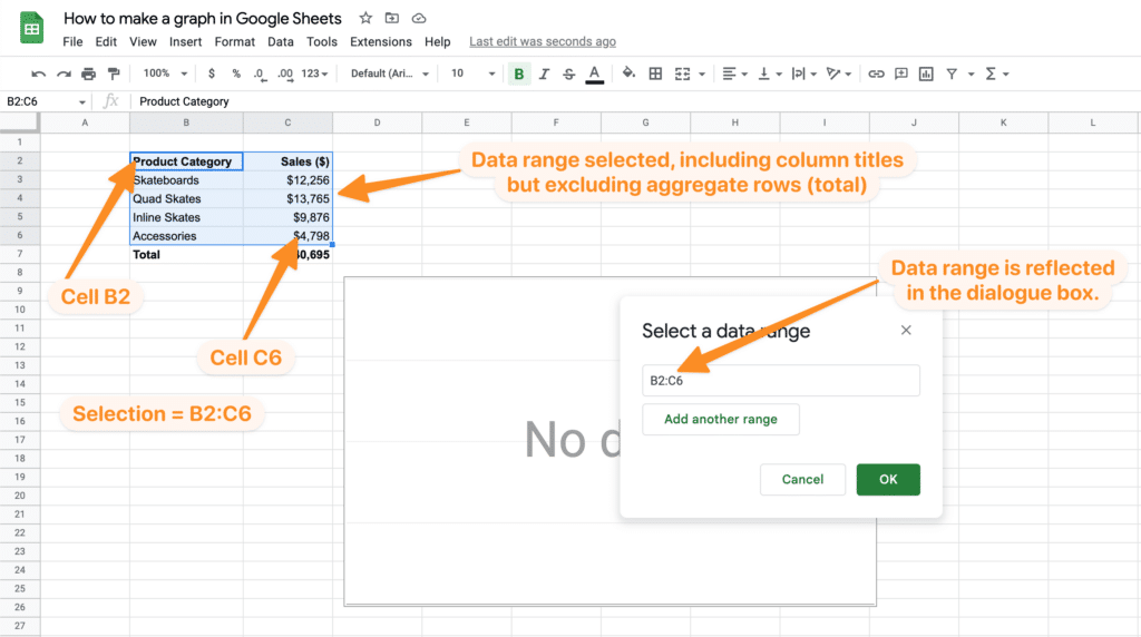
To add the data into the chart click on the little image of a crossed cell at the right hand side of the “Data range” option in the chart editor block. This will in turn display a new dialogue box with the title “Select a data range”.
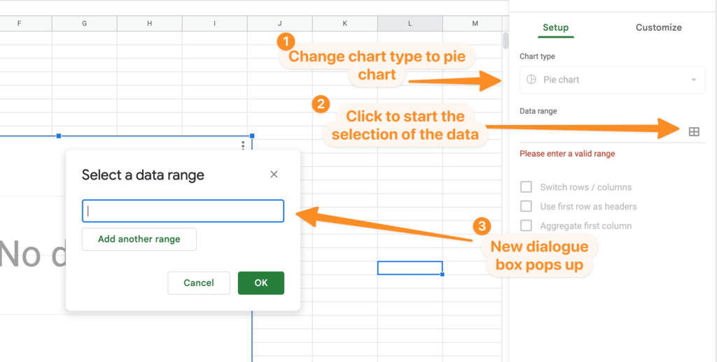
The dialogue box is now expecting you to either manually type in a data range or use your mouse to select a data range. In this example we will use our mouse.
- Ensure the “Select data range” dialogue box is still open. If it is not, click the crossed cell icon in the Data range field in the Chart editor block.
- With your mouse select the data in the top left cell of the data in your range you want to add to the graph. Include your column headings in the data range – this will help Google Sheets try to automatically decide which columns relate to labels and which columns relate to values.
- Hold down your left mouse button and drag the selection to the bottom right cell in your data range.
- Check the “Select a data range” dialogue box has the data range field populated (it should look something like “B2:C6” – but the exact cell references may differ for you).
- Click OK.
Note: Google Sheets refers to categories in your data as “labels” – in our example the labels are product categories. The “values” are the metric you want to chart (in our example sales in $). These are also commonly known as dimensions (labels) and metrics/measures (values).
After you have clicked “OK”, the empty graph container should be populated with a pie chart visualising the data you have selected in the above steps.
In our case Google Sheets is smart enough to work out (from the column headings in our data) what part of the selected data relates to the labels for our data and what part of the selected data are values.
If for any reason your selection did not automatically populate the Pie chart and the Label and Values fields, it is easy enough to tell Google Sheets how to categorise.
After selecting your data range in steps 1 through to 5 above simply click in the “Label” field on the Chart Editor. It will display a list of options allowing you to choose which column contain labels and which column contains values.
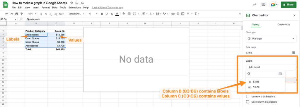
Choose the column containing your labels in the “Label” field. In our example this is column B (cells B3:B6). In the values field choose the column containing your values. In our example this is column C (cells C3:C6).
We generally find it easier to include column labels in the data range selection – and nine times out of ten Google Sheets is smart enough to work it out.
If you data contains more than one column that could contain labels, or more than one column that could contain values then you can select all of the data in the sheet that is relevant and manually let Google Sheets know which columns to use as labels and which columns contain values. Simply click on the “Label” field in the Chart Editor and choose the relevant column containing labels from your data range. Do the same for values.
In some chart types you can have more the one column for data labels and more than one column for values on one chart, but this is not applicable for a standard pie chart.
The alternative way of picking specific columns for labels and values is to only select the relevant columns when selecting your data range.
- First click your mouse in the top left cell of the first column in your data range.
- Hold down your left mouse button and drag the selection downward to the bottom cell in the same column
- Then hold down CMD (Mac) or CTRL (Windows) and move your mouse to the second column to be selected. Click your mouse in the top cell of the column, then drag down your selection to the bottom cell in the same column.
- The above should result in your data range selected but it can be with data across multiple, non consecutive columns.
That’s it – you have now added your graph (pie chart) to Google Sheets.
You can now customise your pie chart. We are going to cover the customization options for each chart type below.
Common Questions relating to adding a graph to Google Sheets.
We usually get a few questions at this stage, we will try to address the most common ones here (but if you have a question that we have not answered, please get in touch and we will be happy to help.
- Question – What if my selected data range contains multiple columns with values and multiple columns with labels – how do I let Google Sheets know which column to use? Answer: In this case Google sheets will not be able to automatically detect the labels and values, you will need to specify the correct columns in the Chart Editor. Simply click in the “Label” field and a list of columns will be displayed – choose the column you would like to use for the label. Do the same for the values.
- Question – How do I move the graph around on the Google Sheet? Answer: Simply click on the graph container. This will highlight the container and the outline will have blue outline. With your left mouse button held down simply drag the graph to where you would like it positioned on the graph.
- Question – How do I make the graph bigger or smaller? Answer: Click on the graph container so you see the blue outline appear. Each of the corners and the middle points on the outline will have a small square. Hold your left mouse button down whilst hovering over one of these points and move your mouse to expand / contract the graph size. Using the corners will scale the graph proportionately using the squares in the middle of each side will simply shrink / grow that axis.
- Question – I have lost the chart editor box on the right of the screen – how do I get it back? Answer: Easy, just double click your left mouse button somewhere on the graph and it will re-appear.
Now you know the basics of adding a chart or graph to Google Sheets, let’s take a look at adding other specific types of chart or graph.
How to make a pie chart in Google Sheets.
In our introduction, above, we cover the basics of adding a graph or chart to Google Sheets. In our example we added a pie chart to our sheet, so you can simply follow those steps when adding your pie chart.
There are a number of customizations you can make to your pie chart to enhance your data presentation so it fits your requirements.
If it is not already visible on your Google Sheet, re-open the Chart Editor by double clicking on the pie chart you would like to customize.
Within the chart editor block you will see a second tab called “Customize” – it is next to the default “Setup” tab.
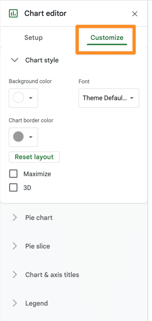
Under this tab you have a few sub sections. For pie charts you have the following options:
- Chart style – to change the overall chart – colors, font, 3D syling etc.
- Pie chart – to customize the specifics of the pie chart – labels, fonts, if you want a donut style hole in the centre of the pie chart (and the size of the hole), text color etc.
- Pie slice – to control the colors of each individual slice of the pie chart.
- Chart & axis title – to add a title to the pie chart and change the font and font size of the titles and subtitles.
- Legend (the labels) – control the styling of the legend elements – where they are positioned, the font and size of the legends and the color of the legend text.
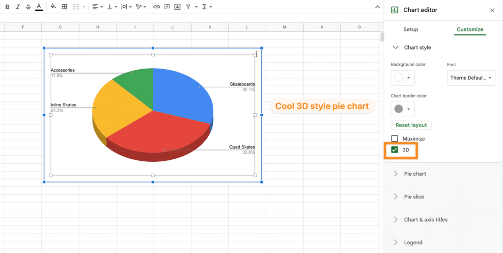
Most of these customization options are self explanatory. Play around with styling and color, to suit your needs. We particularly like the 3D option which gives a nice 3D type view of the pie chart.
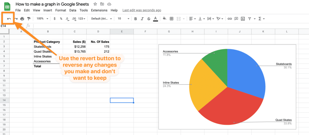
If you make a change to the styling or color of your pie chart and want to revert back, just use the standard “revert” button at the top of your Google Sheets toolbar.
How to make a bar graph in Google Sheets.
A basic bar graph, similar to pie charts, gives a nice, easy simple way of visualizing data based on categories of data and relative sizing of those categories.
Using the same example data we used for creating a pie chart above, we have a simple two column dataset containing product categories and the sales amount in $ for those categories.
The basic steps are the same as adding any type of graph or chart.
- Go to the Insert menu, choose Chart.
- From the chart editor choose Chart Type = Bar
- Select your data range. A simple bar chart in this example will have just one column for labels and one column for values. The selection can be made by clicking on the small cell icon to the tight of the field “Data Range” field in the chart editor. Then use your mouse to click in the top left cell of the range of data and then drag across to the bottom right cell in the data range. Include column headers if they exist in your data.
- If you data contains clear column headers, the bar chart should be automatically generated.
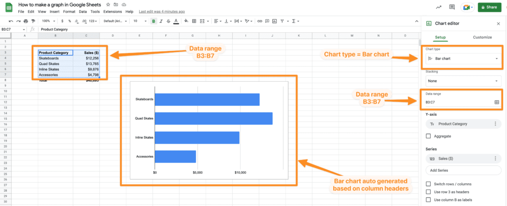
This creates a very simple bar chart based on the data values.
There are various customization options available so you can change the look of your bar chart. Go to the customize tab in the Chart editor box. This gives you the following options to customize your Google sheets bar chart:
- Chart style – background color, font, border color, 3D mode, compare mode (for when you have multiple value columns).
- Chart axis and titles – allows for changing the text, font, font size, format and color for the bar chart title, bar chart subtitle, horizontal axis title and vertical axis title.
- Series – allow you to change the formatting of the series of data (i.e. the columns in your bar graph). You can change the fill color and opacity, the line color and opacity, the line style (these are the markers for the series amounts, in our case the $ amount for each bar in the bar graph). You can also format each specific bar in the series by clicking on the “Add” button next to the option “Format data point”. In addition there are also options to add error bars based on a percentage, constant or standard deviation (error bars give you an overview of margins of error based on the criteria you specify). Lastly under series formatting you can change the way data labels are displayed – you can change font, font size, position (of the label), color and the formatting of the number itself (make percentage, round, change decimal places etc).
- Legend (the labels) – control the styling of the legend elements – where they are positioned, the font and size of the legends and the color of the legend text.
- Horizontal Axis – in addition to the usual font formatting you have options to change scale factor, slanting of the labels (useful if you have a lot of labels to fit into a smaller footprint based on the size of the overall bar graph) and again the format of the number.
- Vertical Axis – allows for formatting of the font, font size, color etc of the vertical axis label. You can also reverse the axis order if desired, so go from high to low or low to high (depending on the order of your data in the data range).
- Gridlines and ticks – this section of the chart editor gives you the flexibility to change the way the ticks (lines that separate categories (for labels) and major divisions (for vales)) are displayed and formatted.
As we mentioned in the general information towards the top of this article you can also move your Google Sheets bar chart around the page by clicking in the chart container and dragging the chart to the preferred location. Sizing changes are also available by clicking on the chart container and using the sizing points to expand and contract the bar chart to the desired size.
We have covered the basic elements of adding a simple bar chart to Google Sheets. There are, of course, many more sophisticated options available such as stacked bar charts, grouped bar charts – we will cover these more in depth topics in a separate article in the near future.
How to make a line graph in Google Sheets.
The final example in this article describes how to add a line graph to Google Sheets. Line graphs are good for displaying data over time. An example may be sales by product category by month of the year.
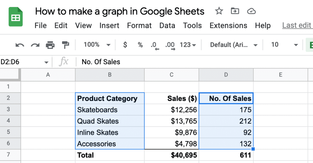
To give an example of a line graph we need to expand our sample data a little.
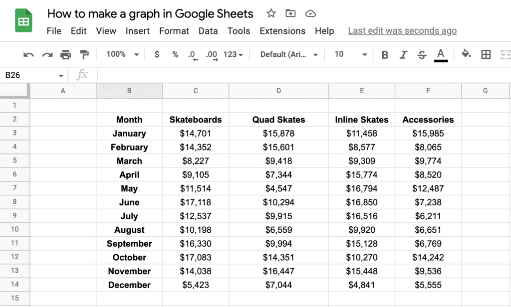
We have now added to our sample data. For each product category we now have sales ($) for each month of the year (January to December).
Adding in this time dimension (months) will allow us to use this for the X-Axis on our new line graph, so we can easily visualise sales over time trends for each product category.
To add your line graph, follow the standard process for adding a graph or chart to google sheets.
- Go to “Insert” from the top menu in Google Sheets. Choose the “Chart” option from the sub menu.
- From the Chart Editor choose the chart type “Line”.
- Select the data range – click the cell icon in the “Data range” field and then use your mouse to select the data to be visualized. In our above example we are selecting data from cell B2 to F14.
- Click OK.
- Your line graph should now be created.
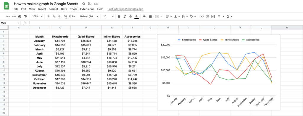
If your data contains multiple product categories (like in our example) you will see that each product category now becomes a separate series on the line graph with each having its own line. If you have just one category of data or no categories at all (just month and total sales for example) then only one line would be displayed on the line graph.
You can manually select columns if you wish to exclude some columns from the graph and include others by opening the Chart Editor again and adjusting the data range to reflect the data you want to display. You can select the data either using your mouse (hold down CTRL (Windows) or CMD (Mac) to select multiple columns, or you can manually type the ranges in the data range field).
Note: to manually type the range in the date range field, you can use this format: B2:B14,D2:D14 – this would select cells B2 to B14 from column B and cells D2 to D:14 from column D (we have omitted column C in this example).
As with all chart and graph types in Google Sheets you can customize how the line graph is displayed and the formatting using the Chart Editor > Customize tab.
The customize tab gives you the following options for line graphs:
- Chart style – change the background color, font, border color for the whole line graph. You also have further options to smooth the lines, maximize the line graph size to fill the entire chart container (with no edge spacing), plot null values etc.
- Chart & axis titles – change the text and formatting of the chart titles and sub title in addition the horizontal and vertical axis titles.
- Series – change the line color, opacity, line type, line thickness, point size, point shape, and axis position for one or all of the data series.
- Legend – change the formatting, color and position of the legend.
- Horizontal Axis – change the formatting, font, font size, and slant of the horizontal axis labels.
- Vertical Axis – Change the formatting, font, font size, scale and number formatting of the vertical axis.
- Gridlines and ticks – change the way the ticks (lines that separate categories (for labels) and major divisions (for values)) are displayed and formatted.
You can also move the line graph around on the Google Sheet and / or change the size by clicking on the graph container and dragging the graph around with your mouse to move the graph and using the sizing tabs to resize the line graph (scale or alter width / height).
Summary
In this article we have given you an introduction on how to add graphs to your Google Sheets. Graphs and other data visualizations are crucial tools to be able to let your data tell a story. If you are looking for trends in your data, anomalies, if you are trying to forecast or compare data, graphs and charts will be invaluable.
This is an introductory article, the possibilities around data visualization are nearly limitless – we will be creating more articles and cover adding more advanced graphs and charts in Google Sheets soon.
If you have any questions relating to anything we have covered in this introductory article, please let us know.